My other posts
Creating architecture diagrams for Azure solutions
Table of contents
Introduction
When I started working with AWS a few years ago, one of the things that made it easier to understand what the team had built and things we would be building was that architecture diagrams followed a standard design. Looking at blog posts and other materials also used similar designs, so there was not much to think about when writing my own diagrams.
As I changed jobs, I moved over to working almost exclusively with Azure. It became very obvious, very quickly that the situation is the opposite of AWS when it comes to designing architecture diagrams - to the point that even Microsoft's Azure architecture references diagram lack standardization.
This bothers me because every time I look at a diagram that I didn't create, I know that I will have to spend time figuring out how they represented things and what they might have forgotten or implied, like network boundaries.
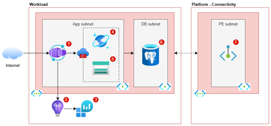
As part of this post, I will explain the steps and decisions that I took to arrive to the following diagram, so that you can have a better idea of an approach that, at least for me, has been successful. As I really enjoy working with Diagrams.net, this is the tool that I will be using for this post.
Important tips
Before getting started with drawing the diagram, I wanted to discuss some tips that I consider more important than many aspects of the diagrams.
Consistency
The first, probably most important tip is being consistent in how you create diagrams, which means re-using as much as possible between diagrams.
For example, don't change the way in which Virtual Networks are represented within the same or across other diagrams. If you need two ways, let's say a simple and a detailed view, then stick to those two ways and be consistent in applying them to diagrams of the same kind.
This tip also applies to the resources added to a diagram of a particular style. For example, it would be OK to have one "low-level" diagram style where you add the Public Load Balancer and Public IP required for a Container Apps Environment, and another "high-level" diagram style where you don't. However, it's not great to mix these decisions or otherwise not being clear about the intentions/style of a particular diagram.
Lastly, unless required by your clients or some other reason, try to stick to the same font/colours/etc. across diagrams.
Know the target audience
It is also very important to know and understand the knowledge of the audience of your diagrams. It may sound obvious, but it wasn't always for me.
By this, what I mean is that you should consider how much Azure knowledge your audience has and to make decisions for the diagram accordingly. If the diagram is just for yourself, you can go as high-level or low-level as you consider useful, while sticking to the consistency rule. If the diagram is for others, try to imagine whether they would need to see low-level resources (such as Network Interface Cards and Disks for Virtual Machines), if it would be better to keep it high-level, or somewhere in between.
Of course, if the diagram is meant to represent the actual resources with the corresponding network boundaries, you will need to add all the resources.
Consider ignoring data flows
In the finalized diagram earlier in this post, you might have seen that there are no direct connectors between the Container App and the databases and Storage account. This is because I prefer to keep diagrams like the above "clean", and adding 3 more connectors to it make it more complicated to both draw and interpret.
For this kind of diagrams, I also prefer to leave out any other external services or resources, such as a central Azure Front Door or Entra ID being used as part of the workload. I added a Private Endpoint which is deployed in an external place, but only because it has to be deployed as part of the workload and deleted when the workload is deleted.
When I want to show the external services and maybe even how one workload depends on others, I create a higher-level diagram that only has the applications and services, but no lower-level resources like connectivity services.
Creating a baseline
The first thing you need to have in a baseline diagram is a box that allows you to delimit the resources that are hosted in Azure.
I like to use either a generic "Internet" cloud icon for APIs/services or the icon of a person or group for front-facing applications.
For the Azure resources, you can decide to separate by:
- Environment: primary and secondary, primary and read replica, etc.
- Subscription: the workload's subscription and other shared subscriptions used.
- Resource Group: the RGs required for the workload and other shared services.
You would then use one "Azure box" for each of those groups that you need. To make it easy to identify them, I add a label to them, left align it and position it on the top with a bold font.
I tend to do a left to right approach, where left is the outside world and the more you move to the right, the more private a resource is. This means that all applications reachable from the internet go very close to the "Internet" cloud icon on the image above.
Finally, it's important to use a consistent colour scheme across these boxes so that the diagram ends up looking nice and cohesive. For the main "Azure boxes", I use the same colour style as for the "VNET boxes" (shown in the following section) but with a white background.
Handling Virtual Networks
Adding Virtual Networks (VNETs) with their subnets is always a tricky business, especially because some resources are deployed to a subnet while other resources only allow access from a subnet.
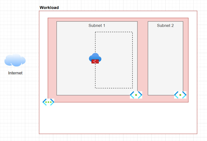
To differentiate from the rest of the resources outside the VNET, I add another box with a coloured background. The inner subnets are again in smaller boxes within the VNET's box, with a third background colour (that is, different from main background's and the VNET's).
Define how you want to denote resources deployed into a subnet - that is, resources that have a private IP from the subnet - versus resources that have a firewall setting to allow access from that subnet.
As there is no standard way of doing this, I ended up going for the approach shown in the last diagram after many iterations, where these resources are inside a dashed line box inside the relevant subnet(s) and a firewall icon to make it a bit clearer.
Names and descriptions
Lastly, I wanted to talk about how I personally handle names and descriptions for services or resources in my diagrams.
My preference for this is to add to the relevant resources in the diagram a small bubble with a number, like in the finalized diagram, repeated below:
I do not add numbers for the VNET or subnet, as the subnets are named and the VNET is quite clearly marked.
At work, we store these diagrams in Azure DevOps Wiki pages, so I add tables like the following to capture relevant details:
| ID | Resource type        | Friendly name | Description |
|----|----------------------|---------------|-------------|
| 1  | Container Apps       | -             | Hosts the ABC application. |
| 2  | Application Insights | -             | Used to store and view app metrics, logs, etc. |
And so on and so forth. I keep a 'Friendly name' column for the cases where there is more than one resource of the same type.
Conclusion
I hope this blog post gives you some ideas of how to create better solution diagrams in Azure.
I have uploaded the three stages of the diagram discussed as separate pages in my GitHub repo..